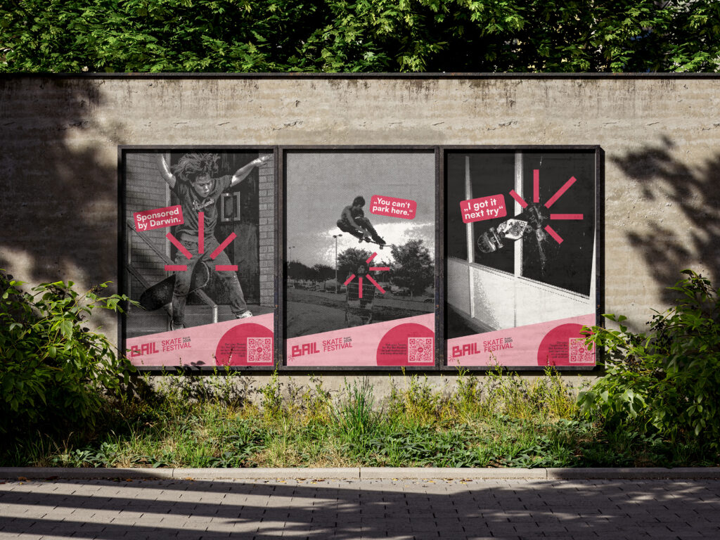
Bail is my final project from university. Here I decided to do something for one of my hobbies: Skateboarding. The name “Bail” means as much as “falling or abort“ and is a very well-known term within the skate community. This is also the basis for the entire mentality of this project. It is rough, loud and vulgar and aims to offer skaters the place they deserve and at the same time make it easier for beginners to get into the scene.
The logo has a very hard and edgy feel to it, but because of the 10° angle it’s still very dynamic. It’s inspired by the „Ollie“ which is the trick everybody learns at the beginning in skating. The sound of the board hitting the ground is visualized by the „Impact-Icon“, which plays a big role in the entire CI.
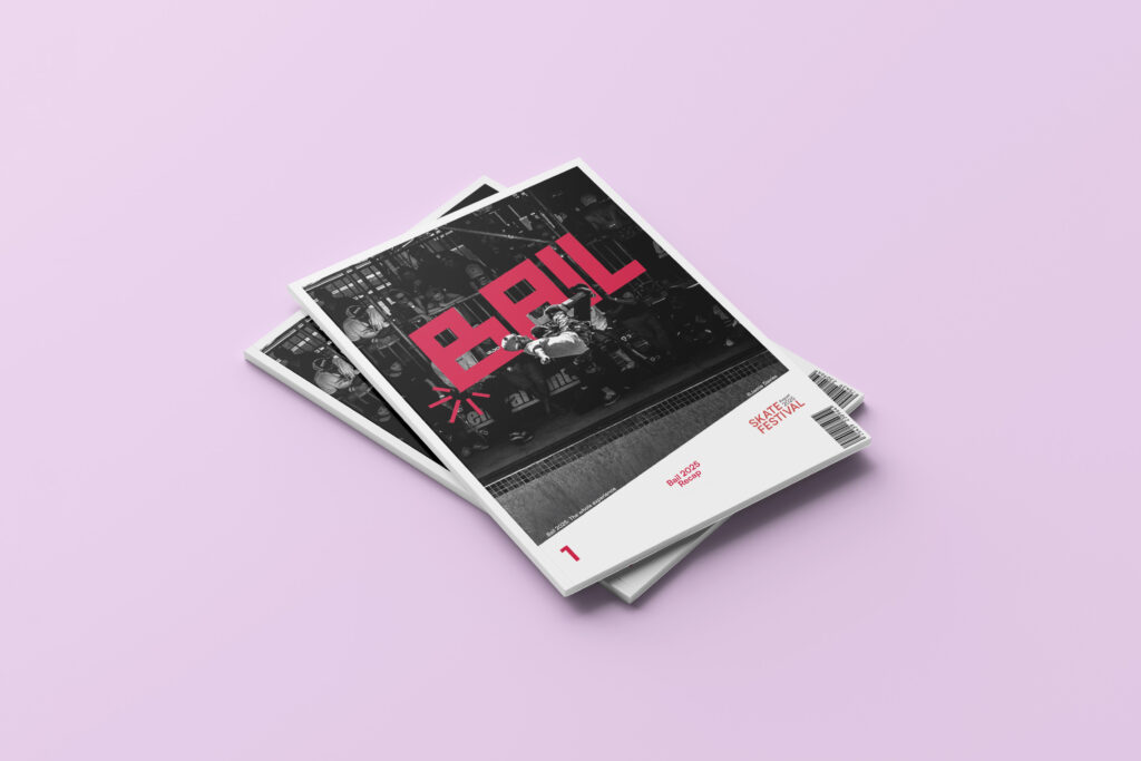
The Website is the place to buy tickets and the Bail Magazine, which was also a big part of the project, to get some new Customers and reach a different audience.
Like i said before, the tonality of this project is very focused on falling, so it made sense to play with it a lot. In skating, you just have to accept that you’re going to get hurt sometimes.
I also developed some of the organizational parts of the festival. Here you can see the site plan. The area is located in WIllhemsburg, Hamburg and is used by many other festivals.